New theme in the works. Preview?

Status
Not open for further replies.

Oliver

ECF Founder, formerly SmokeyJoe
Admin
Verified Member
Hey, sneaking this one in here.

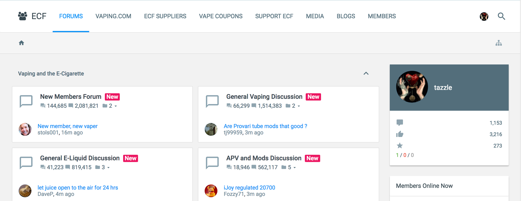
We've just had a new theme installed. It's very bare bones, and needs work, but I wanted to canvass some feedback.

So, please, give it a whirl - You can select it from the bottom of the forum. It's name is "ECF Material".

Let me know what you think

NOTES (suggestions added from thread)

  • Add watched forums/threads/posts back in
  • Dark theme
  • Look at margins below posts and postbit's impact (move info out?)
  • Different color bars for forums
  • Default to rich text editor? Or have setting in profile which allows it
  • quick drop down for alerts/messages
  • sort out supporting members' badges
  • Nice "mood" banners
  • Gender (where declared) in the postbit.
  • Font choice/color tbc
  • 'Reason' portion showing when posts are edited
 
Last edited:

mikepetro

Vape Geek
ECF Veteran
Verified Member
Feb 22, 2013
10,224
81,692
65
Newport News, Virginia, United States
It "feels" clean, and somewhat more compact.

I personally like the dark theme because it is easier on my eyes, but this does look nice.

I also like that the editor has the toolbar without an extra click..

Seems like a lot of wasted space below my "profile" on the left though. Perhaps that "profile" tile can be turned off to reclaim all that real estate. Hehehe - I know who I am, I dont need a tile to tell me.

Also a big margin below each post, would rather have as much content as possible in as little real estate as possible.
 

Katdarling

I'm still here on ECF... sort of. ;)
Supporting Member
ECF Veteran
Verified Member
Jan 25, 2011
32,572
167,591
Utopia
So far, Oliver, it's confusing at best. It actually seems to take more real estate, and as of yet, I cannot seem to navigate to watched threads, etc.

But, having said that, you did say it's bare bones. I'll be happy to give it a chance, but for now, returneth to the older theme, me.
 

BrotherBob

ECF Guru
ECF Veteran
Dec 24, 2014
13,803
12,306
Sunnyvale,CA,USA
Is hard on eyes.---may need work (darker white back ground).
In order to minimize less scrolling, might be room for 4 columns across instead of two (profile and members on line could be across top. ------advantage? may look to busy and hard on the eyes.
May be room for two last thread instead of one thread. ----advantage?
No watched forums.
 

Opinionated

ECF Guru
ECF Veteran
Verified Member
Aug 19, 2015
11,168
59,365
55
My Mountain
I don't think I like it, personally. I like the original better.

Thanks for letting us test it out... but I hope you change your mind on that.

The only aspect I liked on that were the disappearance of ads from the top of the page. That was kind of nice..

other than that, no. Seems cheap, like you don't have the funds for a real site theme, or you don't have a website designer that is any good. (I know, I know.. but that IS what it feels like)

Happy to be back to the old theme now..
 

tazzle

Ultra Member
ECF Veteran
Verified Member
Jan 5, 2014
1,253
3,784
Athens, Greece
First impressions: I kind of like it, but I use the submenu (the one that includes "Watched Forums," "Watched Threads," and "New Posts," among other items) all the time, and I'm not finding this menu. Likewise, I use the user info, inbox and alerts drop downs all the time, and they are also not on the new theme. So for me, it's too bare bones for how I use the site, and wouldn't really be useful, though I understand the desire to streamline.

Aside from that, I mostly like the way it looks, but all the empty speech balloon icons for unread messages are bugging me. Visually, it's just like a page full of these blank speech balloons to me. I like the toggle for visibility of forum sections a lot.

Will check it out more, and report back if anything else occurs to me.
 
Last edited:

Oliver

ECF Founder, formerly SmokeyJoe
Admin
Verified Member
Thanks for the input, gang.....

I've added your suggestions in as notes to the OP.

@Opinionated I think it feels "cheap" because it's unstyled. It's definitely not cheap - it's probably the most advanced theme available.
 

Opinionated

ECF Guru
ECF Veteran
Verified Member
Aug 19, 2015
11,168
59,365
55
My Mountain
Thanks for the input, gang.....

I've added your suggestions in as notes to the OP.

@Opinionated I think it feels "cheap" because it's unstyled. It's definitely not cheap - it's probably the most advanced theme available.


That was the "I know, I know" part of my post. I do know it's not cheap. But yeah, it's the fact it has no style.. or rather, the style it has simply isn't comely.

It's kind of like high fashion in that regard. Not very fashionable, but very expensive.
 

Opinionated

ECF Guru
ECF Veteran
Verified Member
Aug 19, 2015
11,168
59,365
55
My Mountain
First impressions: I kind of like it, but I use the submenu (the one that includes "Watched Forums," "Watched Threads," and "New Posts," among other items) all the time, and I'm not finding this menu. Likewise, I use the user info, inbox and alerts drop downs all the time, and they are also not on the new theme. So for me, it's too bare bones for how I use the site, and wouldn't really be useful, though I understand the desire to streamline.

Aside from that, I mostly like the way it looks, but all the empty speech balloon icons for unread messages are bugging me. Visually, it's just like a page full of these blank speech balloons to me. I like the toggle for visibility of forum sections a lot.

Will check it out more, and report back if anything else occurs to me.

They are there.. At the top of the page (you have to scroll to the top of a page to see it) when your in the new theme there is three bars one on top of the other, followed by a person to the right of those bars with two bubbles on either side of their head then that is followed by the letters ECF.

For the new posts menu click the three bars, from the right a slider menu appears and that's where you find your watched threads, New posts, etc. For your alerts click the flag icon at the top of that slider menu. For your messages click the mail icon - so on and so forth. Everything you want from your profile to watched threads and more is in that side menu. For sending someone else a message, you can still click on their avatar within a thread and get a pop up which includes start a conversation. To make that pop up go away just click elsewhere on the page, same with the right-hand menu, it slides back in when you click elsewhere on the page.

Everything is still there, just a different way to get there.
 
Last edited:

tazzle

Ultra Member
ECF Veteran
Verified Member
Jan 5, 2014
1,253
3,784
Athens, Greece
They are there.. At the top of the page (you have to scroll to the top of a page to see it) when your in the new theme there is three bars one on top of the other, followed by a person to the right of those bars with two bubbles on either side of their head then that is followed by the letters ECF.

For the new posts menu click the three bars, from the right a slider menu appears and that's where you find your watched threads, New posts, etc. For your alerts click the flag icon at the top of that slider menu. For your messages click the mail icon - so on and so forth. Everything you want from your profile to watched threads and more is in that side menu. For sending someone else a message, you can still click on their avatar within a thread and get a pop up which includes start a conversation. To make that pop up go away just click elsewhere on the page, same with the right-hand menu, it slides back in when you click elsewhere on the page.

Everything is still there, just a different way to get there.

I don't think I'm seeing this (or I could just be *really* missing it). Pasting a screenshot of the top of my screen below to see if we're seeing the same thing...

sX8EwSb.png
 
  • Like
Reactions: Opinionated

Opinionated

ECF Guru
ECF Veteran
Verified Member
Aug 19, 2015
11,168
59,365
55
My Mountain
I don't think I'm seeing this (or I could just be *really* missing it). Pasting a screenshot of the top of my screen below to see if we're seeing the same thing...

sX8EwSb.png

Let me get on my laptop and ill do some screen shots for you... I'm on a kindle atm.

Just a minute. BRB.
 
  • Like
Reactions: tazzle

Oliver

ECF Founder, formerly SmokeyJoe
Admin
Verified Member
I don't think I'm seeing this (or I could just be *really* missing it). Pasting a screenshot of the top of my screen below to see if we're seeing the same thing...

sX8EwSb.png
Hover your mouse over "Forums"

@Opinionated - the three bars appear responsively - i.e. when your screen is smaller (or if on mobile).
 
Status
Not open for further replies.

Users who are viewing this thread