
Is v2 going to be black and engraved or silver and etched?
You are using an out of date browser. It may not display this or other websites correctly.
You should upgrade or use an alternative browser.
You should upgrade or use an alternative browser.
Prodigy V2 Logo Contest :)
- Thread starter CaSHMeRe
- Start date
- th_trl_thread_readers 0
- Status
- Not open for further replies.


I came up with a few more versions for the style I was working on. However, I seem to have run out of user space to attach them.
Guess I'll leave well enough alone. =)
Ack
Guess I'll leave well enough alone. =)
Ack
This is my first entry for the PureSmoker Prodigy Logo Design Contest. Im going to try to keep it down to two entries to avoid swamping the judging with scattershot attempts. I have over a dozen sketches done for this project and putting all of them in would just muddy the waters.


(Hey, MadEyeTony, Thanks a lot! I didn't know how to put those in here!)
To the extent that I have any education in design, I can say that I was taught that design is taste, technique and intention. Taste is impossible to explain because it differs from one person to another; technique is knowing how to use your tools without hurting yourself and requires no explanation--you either know where the kerning command is and why you should use it or you dont.
Intention is something different. It can be explained and has to be: without it, you cant tell the client (in this case, YOU, the voter are the client) why you did what you did and why it is arguably better (that is, more effective communication) than any of the ten-thousand other design decisions you might have made.
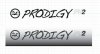
The attached JPEGs show two images of the same logotype, done in Adobe Illustrator with the first image showing the raw image in black-and-white, the second one shows the same image against a gradient fill to give an idea of how a laser-etching of the logo would look on a piece of steel.
The images show what I did. This is why I did it:
I chose the pure smoker PS logo logo because PureSmoker wanted it there. The designer who made it spent time and energy making it work and it would be disrespectful to him to arbitrarily change it. The PS logo you see here is only an approximation of it; without the original designers skill and font collection-neither of which I have. It would have taken a *looooong* time to remake it from scratch. Mine is just a placeholder.
I chose prodigy in a handwritten font to continue the design of the original. The word Prodigy means either a person who is especially good at what he does at a young age, but it can also mean a highly unusual event seen as a portent--a miracle that causes wonder. A device that lets you smoke without smoking certainly classes as a prodigy.
This handwritten font looks as if someone with artistic talent took a magic marker and wrote the word with spontaneous ease. The handwritten font (Dakota, modified in Illustrator) conveys motion without having to put on flames or racing stripes. Also, the combined shapes of the letters as a block provide a better negative space (the space around the combined letterforms) than a visually simpler font might.
I chose PV2 in a superscript because the contest rules seem to call for it. I filled in the 2 in the line to create contrast with the PV--to let it pick up the color of the PureSmoker logo at the beginning of the line. I dont know how the logo should be scaled, but the length of the whole logo in the file is three and one-half inches. It can be scaled down and, if need be, the PV2 can be dropped altogether.
I kept it simple because simplicity is one way of trying to create elegance. Whatever logo goes onto the next prodigy will be laser-etched *forever* onto thousands of copies. People are going to ask, hey, what is that, can I see it? You dont want a design that will make anyone actually *laugh* when you hand it over.
I tried to keep them simple because simplicity is good; a good design says what it has to and then fades into the background. A bad design in something you use on a daily basis, is like walking into a bar every day and having a drunk tell the same joke every time he sees you.
The second image is an attempt to acknowledge that the original Prodigy is a classic and that the new one refers to it. It says, if youre willing to buy a prodigy, you already know what it is, so theres no reason not to depart from the original graphic and simply call it a PV2 in a disciplined and modern design that nods to the original by showing the name under the model designation.
One virtue of the second design is that it is easier to use in advertisements since it can be trimmed and used as a graphic more easily than the other.
Those are my reasons for these designs. Thanks for your attention, and I hope youll agree with my reasons and either vote for one of my designs or a better one.
(Hey, MadEyeTony, Thanks a lot! I didn't know how to put those in here!)
To the extent that I have any education in design, I can say that I was taught that design is taste, technique and intention. Taste is impossible to explain because it differs from one person to another; technique is knowing how to use your tools without hurting yourself and requires no explanation--you either know where the kerning command is and why you should use it or you dont.
Intention is something different. It can be explained and has to be: without it, you cant tell the client (in this case, YOU, the voter are the client) why you did what you did and why it is arguably better (that is, more effective communication) than any of the ten-thousand other design decisions you might have made.
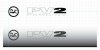
The attached JPEGs show two images of the same logotype, done in Adobe Illustrator with the first image showing the raw image in black-and-white, the second one shows the same image against a gradient fill to give an idea of how a laser-etching of the logo would look on a piece of steel.
The images show what I did. This is why I did it:
I chose the pure smoker PS logo logo because PureSmoker wanted it there. The designer who made it spent time and energy making it work and it would be disrespectful to him to arbitrarily change it. The PS logo you see here is only an approximation of it; without the original designers skill and font collection-neither of which I have. It would have taken a *looooong* time to remake it from scratch. Mine is just a placeholder.
I chose prodigy in a handwritten font to continue the design of the original. The word Prodigy means either a person who is especially good at what he does at a young age, but it can also mean a highly unusual event seen as a portent--a miracle that causes wonder. A device that lets you smoke without smoking certainly classes as a prodigy.
This handwritten font looks as if someone with artistic talent took a magic marker and wrote the word with spontaneous ease. The handwritten font (Dakota, modified in Illustrator) conveys motion without having to put on flames or racing stripes. Also, the combined shapes of the letters as a block provide a better negative space (the space around the combined letterforms) than a visually simpler font might.
I chose PV2 in a superscript because the contest rules seem to call for it. I filled in the 2 in the line to create contrast with the PV--to let it pick up the color of the PureSmoker logo at the beginning of the line. I dont know how the logo should be scaled, but the length of the whole logo in the file is three and one-half inches. It can be scaled down and, if need be, the PV2 can be dropped altogether.
I kept it simple because simplicity is one way of trying to create elegance. Whatever logo goes onto the next prodigy will be laser-etched *forever* onto thousands of copies. People are going to ask, hey, what is that, can I see it? You dont want a design that will make anyone actually *laugh* when you hand it over.
I tried to keep them simple because simplicity is good; a good design says what it has to and then fades into the background. A bad design in something you use on a daily basis, is like walking into a bar every day and having a drunk tell the same joke every time he sees you.
The second image is an attempt to acknowledge that the original Prodigy is a classic and that the new one refers to it. It says, if youre willing to buy a prodigy, you already know what it is, so theres no reason not to depart from the original graphic and simply call it a PV2 in a disciplined and modern design that nods to the original by showing the name under the model designation.
One virtue of the second design is that it is easier to use in advertisements since it can be trimmed and used as a graphic more easily than the other.
Those are my reasons for these designs. Thanks for your attention, and I hope youll agree with my reasons and either vote for one of my designs or a better one.
Attachments
Last edited:
I came up with a few more versions for the style I was working on. However, I seem to have run out of user space to attach them.
Guess I'll leave well enough alone. =)
Ack
Hey Ack, you could post them to imgur: the simple image sharer for free. Upload your image, copy the direct link, click on add image in the forum controls and paste. You should be good to go. Any questions? Fire away
")
MadeyeTony:
Thanks. However. I need 15 post to enable links in posts. i have 12 now. . . err 13 from this =)
be back in a few min's. gona say hello to some new folks.
Ack
Thanks. However. I need 15 post to enable links in posts. i have 12 now. . . err 13 from this =)
be back in a few min's. gona say hello to some new folks.
Ack
Ok last 2 adaptations of the style that I was working on.


Ack.
Ack.
Well done Ack , i think those are my favorite so far...
AMAZING submissions EVERYONE !!!! Just Amazing !!!! Thank you all for contributing !!!! Voting will close tomorrow (Tuesday) at 12 noon Central Time -- So we can get a voting poll up later in the day tomorrow!!!!!!
Thank you all for contributing !!!! Voting will close tomorrow (Tuesday) at 12 noon Central Time -- So we can get a voting poll up later in the day tomorrow!!!!!!

Het Steve,
Do you have any idea when these will be available? I'm wanting/needing to buy a new HV mod because the one I bought elsewhere turned out to be a piece of crap compared to my Protege. If the Prodigy 2 is made anything like my Protege, and I'm sure it will be, I'll wait!!
Do you have any idea when these will be available? I'm wanting/needing to buy a new HV mod because the one I bought elsewhere turned out to be a piece of crap compared to my Protege. If the Prodigy 2 is made anything like my Protege, and I'm sure it will be, I'll wait!!
hey pete ...
I have come to the realization, they *may* not be ready by Christmas ... We had an arm on one of the maury machines break over the weekend ($5,000+) fix, so I'm not entirely sure when I will open up preordering.
Not sure if anyone was hoping to give a Prodigy V2 as a Christmas gift. If no one was planning on it, and they don't mind waiting 3-4 weeks, I can open up preordering now ....
-Steve
IM IN,,,,,,,,The More PAID Preorders The more faster the Money for the Machine to get fixed ?
?
How much are they going to be? I *may* be able to be "IN" as well....
Start the preordering and just make it clear on your website the wait time. Do it before the holidays.
Ok last 2 adaptations of the style that I was working on.
Ack.
is very nice.
Here are a couple of logos to throw in the mix.
Version 1 - taking the old logo and maturing it.

Version 2 - a new futuristic look.

Version 1 - taking the old logo and maturing it.
Version 2 - a new futuristic look.
- Status
- Not open for further replies.
Similar threads
- Replies
- 117
- Views
- 11K
- Replies
- 100
- Views
- 12K
- Replies
- 35
- Views
- 4K
- Replies
- 24
- Views
- 4K
- Replies
- 31
- Views
- 4K
Users who are viewing this thread
Total: 2 (members: 0, guests: 2)