Prodigy V2 Logo Contest :)

Status
Not open for further replies.

Pete54

Ultra Member
ECF Veteran
Verified Member
Oct 30, 2009
2,637
3,412
Clearwater, Florida
hey pete ...

I have come to the realization, they *may* not be ready by Christmas ... We had an arm on one of the maury machines break over the weekend ($5,000+) fix, so I'm not entirely sure when I will open up preordering.

Not sure if anyone was hoping to give a Prodigy V2 as a Christmas gift. If no one was planning on it, and they don't mind waiting 3-4 weeks, I can open up preordering now ....

-Steve

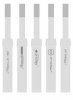
Did I miss it or do you have a pic of one if it's gonna look any different than the previous Prodigy? Have you decided on 5v only? Will it fit protected cr123's? I'm getting freakin' excited here ........need ....some ...36mg .......................
 

Johnny 5

Super Member
ECF Veteran
Verified Member
Jul 1, 2009
344
0
Oakville, WA
I don't have time to put something decent together myself, but I'm surprised no one has submitted a vertical text "PRODIGY" in the PS font, or similar, with the logo in the O.


Here you go:


johnny-5-albums-stuff-picture3919-pvii-ii.jpg
 

mgrimes

Senior Member
ECF Veteran
Dec 7, 2008
141
1
San Diego, CA
Made a composite sheet of all my entries - the little forum thumbnails from prior posts are just too small to be noticed.

Steve, thanks for clarifying about running text vertically -- that was how I always envisioned the V1 being as it always felt strange to not be able to read the text well sitting upright.

Viewing Puresmoker V2 Logo Contest details :: Ember
 

indyjoey

Full Member
ECF Veteran
May 12, 2009
32
0
So I was curious what some of my submissions might look like on the new device. So... using a protege, I traced the size (on a 1900x1200 screen). Might look bigger if you have a lower screen resolution.

In any case, I am also attaching a blank incase anyone else was curious what their submission might look like. The atty traced was a 901 on the protege.

Edit: Hmm... looks like the forum re-sizes the uploaded image a bit. : (

5280d1260237168-prodigy-v2-logo-contest-ps2.jpg
 

Attachments

  • ps2.jpg
    ps2.jpg
    15.9 KB · Views: 148
  • blank.jpg
    blank.jpg
    3.1 KB · Views: 24
Last edited:

lotus14

Ultra Member
ECF Veteran
May 3, 2009
1,460
1
Columbia SC
Well just one more vertical minus the V2.

v23.jpg

Kevin man, those are both so close to perfect! A little tweaking and none of the others come close.

I would make the logo a tad smaller and either tone down the background of the logo or better yet add a little chrome effect to the outside of the lettering stroke so it blends together a little better.

For the second one you might make the P a Pv2 or Pv2 , maybe with the v2 in a thinner stroke small circle itself.
 
Status
Not open for further replies.

Users who are viewing this thread