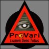
ProVape/Provarinati collaboration - Help pick a new design!

Status
Not open for further replies.

PLANofMAN

Signature Guru
ECF Veteran
Verified Member
Dec 9, 2012
4,147
8,070
45
Woodburn, OR
Draft 2 is the one I would choose.

5785c697-4134-48d8-b236-ffc5ce1704b8_zps8ba20cb2.jpg
Just so you know, the current (see above) version of the eye is the fourth or fifth revision of it. The one posted earlier that looks like a simplified version of it, is actually an earlier version. Eddard posted a full lineup of the evolution of the eye once...somewhere. It's changed a lot in the last year or so. It's one of the reasons why I have made so many variations of it in the signatures.

The original concept was as "The All Seeing Eye" and somewhere along the way, it turned into the eye of Ra, and later, the eye of Horus. I was kind of wanting to go back towards the original "illuminati" inspired all seeing eye, as I think it fits better with the Provarinati concept.

...on the other hand, we don't tend to take ourselves very seriously, even at the best of times. :D

Edit:
Me too! Dig in' it. If the vent holes are incorporated in the circle, and the Lumen Sees Totus were curved on the bottom like the provarinati is at the top maybe even in the same font, I just might be one happy camper :)

For those wondering why I haven't done the Lumen Sees Totus in the Fyrewater ambigram font, the reason is simple. It looks terrible. Multiple words don't come through well, and some ambigrams just plain look bad. I think Ocelot has given it a go once too, and she agrees. It just isn't workable. Usually, words with matching numbers of letters work, but because the "m" uses 2 letters to make it's letter, it throws off the ambigram and doesn't allow it to be split into separate words.

When I do split it up, individually, Lumen and Totus are not compatible, so I have to work with it that way. If I do, it reads "Lumen sees Totus" & "Totus sees Lumen." again, it doesn't work as an ambigram. I really have tried to do it.

lumenseestotus_zps36b28902.gif
 
Last edited:

kas122461

Vaping Master
ECF Veteran
Jun 15, 2013
5,211
30,637
63
Indiana, USA
Just so you know, the current (see above) version of the eye is the fourth or fifth revision of it. The one posted earlier that looks like a simplified version of it, is actually an earlier version. Eddard posted a full lineup of the evolution of the eye once...somewhere. It's changed a lot in the last year or so. It's one of the reasons why I have made so many variations of it in the signatures.

The original concept was as "The All Seeing Eye" and somewhere along the way, it turned into the eye of Ra, and later, the eye of Horus. I was kind of wanting to go back towards the original "illuminati" inspired all seeing eye, as I think it fits better with the Provarinati concept.

...on the other hand, we don't tend to take ourselves very seriously, even at the best of times. :D

I think that is why I like draft 1, I liked the first versions, and like the eyes that are looking straight at you, and with the 2nd draft there is too much stuff around the eye, kind of takes your eyes, off the eye, so to speak.

KAS
 

Simply Red

Vaping Master
ECF Veteran
Verified Member
Oct 27, 2013
4,972
9,071
I'm here, when I'm here
Just so you know, the current (see above) version of the eye is the fourth or fifth revision of it. The one posted earlier that looks like a simplified version of it, is actually an earlier version. Eddard posted a full lineup of the evolution of the eye once...somewhere. It's changed a lot in the last year or so. It's one of the reasons why I have made so many variations of it in the signatures.

The original concept was as "The All Seeing Eye" and somewhere along the way, it turned into the eye of Ra, and later, the eye of Horus. I was kind of wanting to go back towards the original "illuminati" inspired all seeing eye, as I think it fits better with the Provarinati concept.

...on the other hand, we don't tend to take ourselves very seriously, even at the best of times. :D

Ah. A history lesson! As "cool" as the one I posted is, far be it from me to dispute the original. If "Draft #1" is a variation of "The All Seeing Eye", I'm all for the "In the beginning...." :toast: In any case, if image.jpg is on the cap, count me in! :thumb:
 

Fir3b1rd

Moved On
ECF Veteran
Mar 27, 2014
5,961
8,046
48
Just so you know, the current (see above) version of the eye is the fourth or fifth revision of it. The one posted earlier that looks like a simplified version of it, is actually an earlier version. Eddard posted a full lineup of the evolution of the eye once...somewhere. It's changed a lot in the last year or so. It's one of the reasons why I have made so many variations of it in the signatures.

The original concept was as "The All Seeing Eye" and somewhere along the way, it turned into the eye of Ra, and later, the eye of Horus. I was kind of wanting to go back towards the original "illuminati" inspired all seeing eye, as I think it fits better with the Provarinati concept.

...on the other hand, we don't tend to take ourselves very seriously, even at the best of times. :D

Edit:


For those wondering why I haven't done the Lumen Sees Totus in the Fyrewater ambigram font, the reason is simple. It looks terrible. Multiple words don't come through well, and some ambigrams just plain look bad. I think Ocelot has given it a go once too, and she agrees. It just isn't workable. Usually, words with matching numbers of letters work, but because the "m" uses 2 letters to make it's letter, it throws off the ambigram and doesn't allow it to be split into separate words.

When I do split it up, individually, Lumen and Totus are not compatible, so I have to work with it that way. If I do, it reads "Lumen sees Totus" & "Totus sees Lumen." again, it doesn't work as an ambigram. I really have tried to do it.

lumenseestotus_zps36b28902.gif

I kind of prefer it with lumen Sees Totus taken off.
I just couldn't find a way to make it look like it belonged for some reason.
Even when I was trying to fit in underneath it always looked like that thing someone forgot to do and crammed in at the last second

I can't help but feel that the cleaner one with just the triangle and provarinati is a much better option. And I like both versions of the eye.
 
Last edited:

kbf101998

Ultra Member
ECF Veteran
Verified Member
Aug 30, 2013
1,759
3,917
Brentwood, Tn, USA
Draft 1:
ENDCAPFinalDraft1_zps8bfc9327.gif


Draft 2:
ENDCAPFinalDraft2_zps522f2d69.gif


Looks like these might be final drafts, With only the spacing between the letters and the "knobs" on each letter to be addressed. :) The "final" final version of the "Provarinati" logo will follow the curve of the outer ring much more closely. ...and most likely be slightly larger as well.

I like Draft #2 best. I am happy with either as they both look good.
 

Susan W.

Vaping Master
ECF Veteran
Verified Member
Apr 30, 2013
8,195
11,970
Torrance, CA
I've tried GIMP and it seemed like it had lots of features for a freeware product. I didn't use it very long as I'm already familiar with Photoshop so it's easier for me to use.

You might check into "GIMP." It's a freeware photo editing program available online. I've not tried it, but I know other people who have used it and were happy with the features.
 

Train2

ECF Guru
ECF Veteran
Verified Member
May 11, 2013
12,273
36,193
CA, USA
First, AWESOME job, taking LOTS of suggestions into account, and filtering through the ones that just weren't going to work...

I like BOTH of them. And I checked, and I like them both upside down, too.
If I had to express a preference, I'd maybe go with V2, because it WAS the eye already - and why change to a new one if it's not better?

I also like MonsterKenny's modified eye - if it's going to engrave better...(but not the font - it's GOT to be the ambigram!).
Thanks for all the work, POM!


Draft 1:
ENDCAPFinalDraft1_zps8bfc9327.gif


Draft 2:
ENDCAPFinalDraft2_zps522f2d69.gif


Looks like these might be final drafts, With only the spacing between the letters and the "knobs" on each letter to be addressed. :) The "final" final version of the "Provarinati" logo will follow the curve of the outer ring much more closely. ...and most likely be slightly larger as well.
 

RebelGolfer72

Moved On
ECF Veteran
Apr 28, 2010
1,604
3,451
Pittsburgh, PA
You might check into "GIMP." It's a freeware photo editing program available online. I've not tried it, but I know other people who have used it and were happy with the features.

Good thing that Tony is a cool guy...most folks in a wheelchair would run you over for suggesting they use a program called GiMP
 

Fir3b1rd

Moved On
ECF Veteran
Mar 27, 2014
5,961
8,046
48
Good thing that Tony is a cool guy...most folks in a wheelchair would run you over for suggesting they use a program called GiMP

Hahahaha- that makes me want the program even more!!!!
-that's my nickname around here.
- I'm far from the Lt Dam type until I see stupid .....
The running joke with my fiancé is that she is gonna roll me into traffic one of these days. That's how I got put in the chair.
She actually did once. When the saints flew home after an away game she rolled me in front of Drew Brees car so that she could get his autograph.
It was HILARIOUS- I made it look like I was about to be thrown over the hood. OMG we still get a good laugh at that one.
 
Status
Not open for further replies.

Users who are viewing this thread